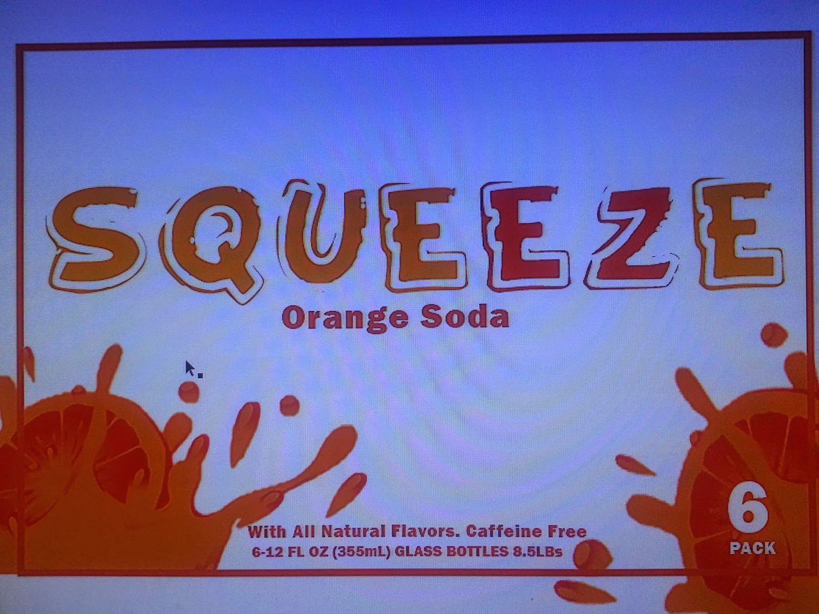
So This is my package design for my soda company called SqueEZe or Squeeze Easy. I picked a fun font to grab the consumers attention called Funny Kid and then teamed it with the font Franklin Gothic Heavy. I think its eye catching and the colors are consumer friendly for the beverage industry. The wraps I chose for my bottles are based off the same kind of style that B&J used on their alcoholic beverages. The Nutritional information, upc and ingredients of the product are found on the bottom of bottle packaging itself. My goal was for this product to look clean and modern but yet capture the fun aspects of a soda. My idea for the bottle caps was to have them painted like oranges however the paint wouldn't hold to the caps so orange circles are there in place to represent that. I enjoyed this project.


No comments:
Post a Comment