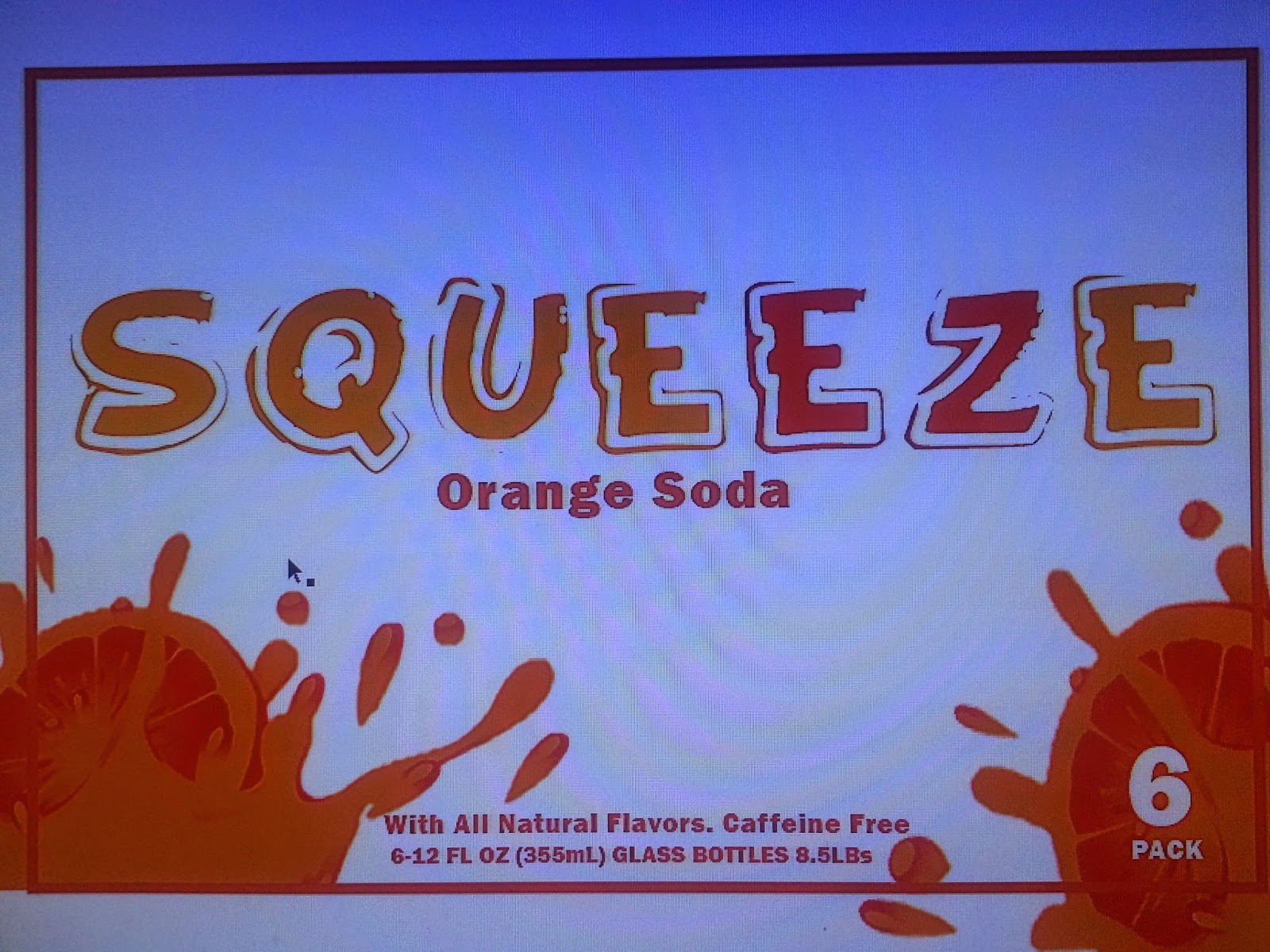
So This is my package design for my soda company called SqueEZe or Squeeze Easy. I picked a fun font to grab the consumers attention called Funny Kid and then teamed it with the font Franklin Gothic Heavy. I think its eye catching and the colors are consumer friendly for the beverage industry. The wraps I chose for my bottles are based off the same kind of style that B&J used on their alcoholic beverages. The Nutritional information, upc and ingredients of the product are found on the bottom of bottle packaging itself. My goal was for this product to look clean and modern but yet capture the fun aspects of a soda. My idea for the bottle caps was to have them painted like oranges however the paint wouldn't hold to the caps so orange circles are there in place to represent that. I enjoyed this project.
Wednesday, March 25, 2015
Sunday, March 22, 2015
Six pack design
So I chose the Orange soda pop route as discussed before. However I based my design off of an alcoholic beverage Called B&J's or Bartles and James. I liked their simple design of their glass bloated bottles and changed it to fit my needs. Sticking with the single paper wrap around the bottle to display the brand name and such. I mocked up a prototype for todays critique. I really didn't have any in between steps that aren't pictured other than the adding of the white line. And both pictures are displayed. I liked the use of the three simple colors and the eye catching Squirt or Squish. I think its very modern and sleek.
Tuesday, March 10, 2015
Six pack design. Crush Concept.
I have decided to remake the crush orange soda. I liked the simplicity of the crush brand and the endless opportunity that came with the fun zany color. I'm considering doing bold chunky text and interesting graphics on both the bottle and the Box to really ad a Wow factor. The Crush brand is excellent however I think I can make it even better. If doing a remake of the soda is not expectable I'll name the brand Squeeze or something along that lines so that I may continue down the path I've chosen. I like the clear bottles and easy to read graphics with pops of color. I think this will be an awesome project! The Concept is to make the consumer aware that orange soda and the color orange and the orange fruit are one in the same. To bring that natural home grown feel.
Monday, March 9, 2015
Monday, March 2, 2015
Subscribe to:
Posts (Atom)


