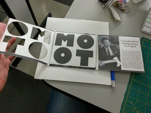
My Zebra concept stems from that of camaflauge. The idea is that you would be viewing the Zebra through Moot. Very much like seeing Moot in concert. Because Moot created the song called the zebra and sees himself much like the Zebra traveling I decided to portray Moot as the Zebra. Incorporating dy cuts and windows. To give the idea that the Zebra is much like Moot's soul and essentially is Moot himself. The front would be a window of Moots name and then would open to a photo or photos of a Zebra, that would then open to the CD itself as a zoomed in version of the Zebra, his face or hide or just a plain white CD with Moots photos and info on the back side of the hinges.
http://netdna.webdesignerdepot.com/uploads/business_card_design/davidegasperini.jpg
http://www.thecultureconcept.com/circle/andy-warhol-pop-art-prince-king-of-peoples-perceptions
http://www.acdsleeve.com/category/custom-work/

 I really just wanted to focus on signage with text. I thought It would be the most interesting way to change the feel of the building itself. Make it fun and more interesting. Paula Scher's public theater signage, and Michael Bierut's — New York Times signage, Saks signage. Is really what I drew the concept from.


