Tuesday, May 5, 2015

Wendy's Final

Wendy's Final

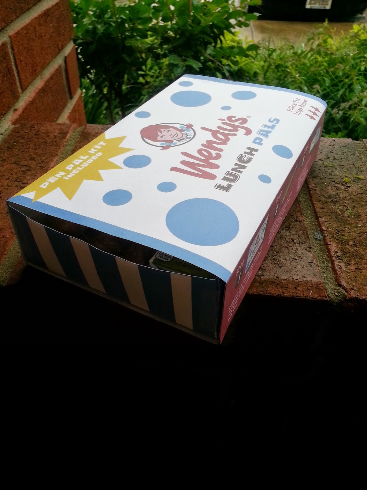
I made a kick butt kids pack out of card stock. 

Photos of finished product. Contains Juice pack, dinosaur chicken nuggets, apple slices with caramel dipping sauce and a toy. I also showed the product in its natural habitat. On a table. On a bench. Outside for a picnic.
 
I have decided to have a Wendy's Mailbox set up for the kids to deposit into. However the postcards ended up to large for the mail. So in order to mail the postcards the manager of each Wendy's would collect the postcards over time and then mail all of the postcards as a bulk mail to the Wendy's address. This would allow Wendy's to collect and count the postcards and keep track of the products progress over time.
 
The edges of the back panel of the outside wrap are perforated for easy removal of the post card and pencils will be provided by each store.


Monday, April 20, 2015

kids pack 2


Designed a mock up of the Tray and wrap box. That slides out and packs away rather than a cube. 
I would like to find or replicate the logo that Wendy's puts on their packaging to keep it unified. Not set on the text as of right now but I find it fun. 

Outside wrap of the Box.


This is the Layout for the food tray inside the Box. 

Looking at using animal shaped chicken nuggets and apple slices with a generic juice box. With a toy. Healthy option. Kids can choose from apples/bananas/ Orange/ Fruit snacks/ Granola bar/ Cookie

Main courses would be chicken, fish sticks, small hamburger, chicken salad the green kind. 

Went with the Red and white because of their current adult packaging is Red and white and wanted packaging to look unified. 

I'm not set on the block box, Maybe Wendy's Bites, Wendy's Lil' Wiggle,  Wild Wendy's. 


Below is an example of the adult packaging. That they currently have and the logo I would like to use.

Kid pack they currently offer. Came with a nasty chicken sandwhich patty a small soda and a pack of french fries with a toy. An advertisement for a movie rather than designed package that contains Wendy's food. 


Wednesday, April 15, 2015

kids pack

Red and white. 

Interesting box design. 


Trying to work with Form. 

Looked at their website… to see their kids meals… interesting selection. Maybe include a banana? Granola? Chicken nuggets that look like animals? Fruit that looks like animals? Juice box. Water. Gatoraid? Sandwhich?


Back ground story on Wendy's brand and corporation.


Going contemporary? Maybe introduce the Wendy's Cube.. Design based off a rubics cube.  Container a cube box design. With cube holders for drinks, burgers, fries. Team up with Minecraft maybe. Go extreme cubism. 

Kid's pack name:: Wendy's Cube. Wendy's Block. Wendy's Block Box… Wendy's Squared. Wendy's Wedges.  Wendy's Mac Pack.

Wednesday, April 8, 2015

Lit light bulb package design final.

Definition of lit.
A simple past tense and past participle of light.
Inspired by
Destijl
Mondrian
Bauhaus
Font
Honey script from dafont.com
Concept
Based on the designs done by those who initially inspired me thanks to mrs. Speligene.
Di cut to show watage and provide product suport. Minimal sleek design.
This website about minimalism helped me alot.
http://guity-novin.blogspot.com/2010/03/history-of-graphic-design-minamalism.html?m=1